The Importance of Clear Website Navigation for Better User Experience
Alright, let’s have a real talk about your website for a minute. I get it. You’ve probably poured your heart into it—getting those perfect “after” photos of the kitchen you renovated, writing up descriptions of your services, maybe even investing in a professional video.
That’s all great. But can I let you in on a secret?
There’s a part of your website that doesn’t get much glamour, yet it’s more important than all of that other stuff put together. I’m talking about your website navigation—that simple menu bar at the top of the page.
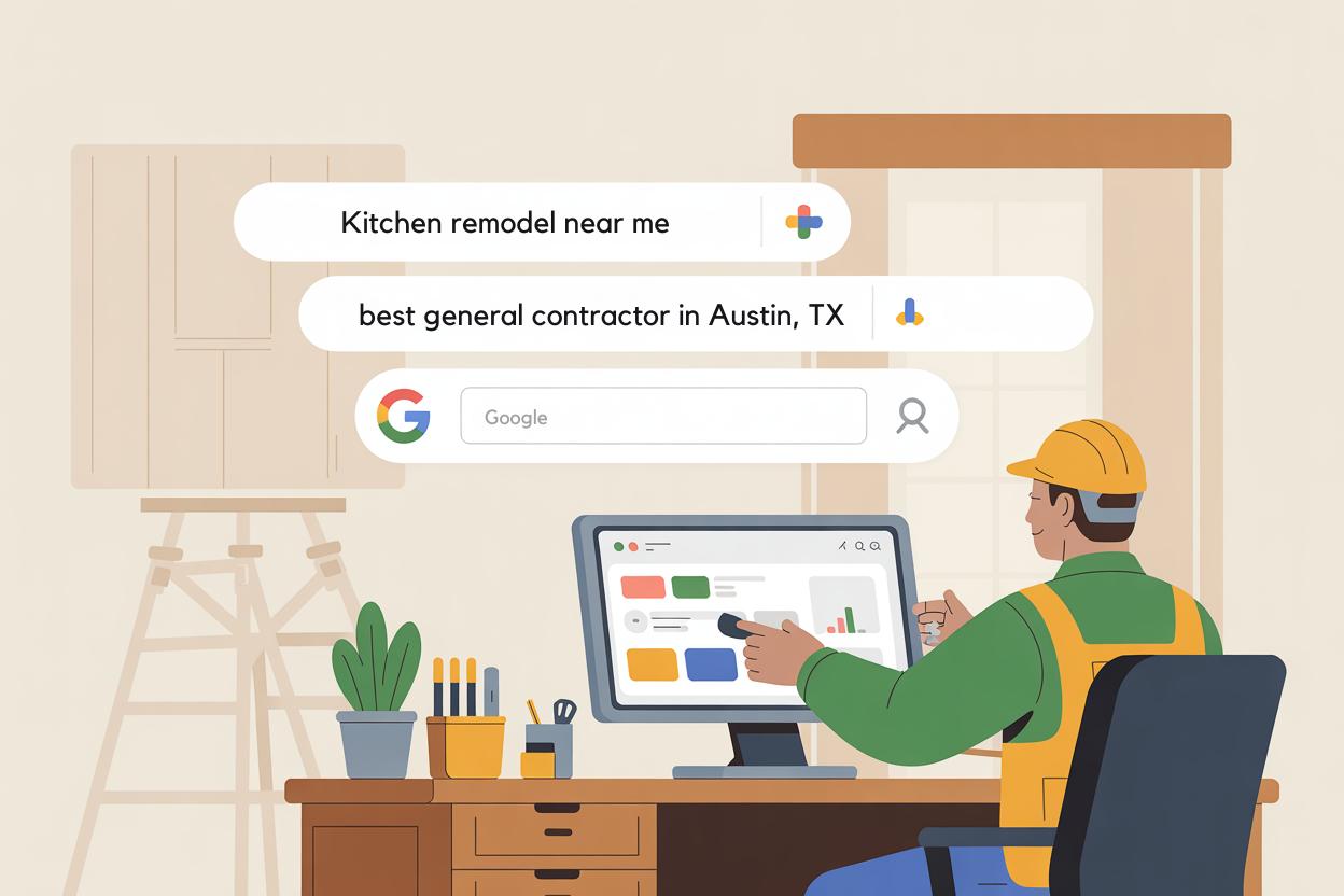
Think of it as the roadmap to your entire business. Every single person who visits your site uses it to find their way. And if that map is confusing or leads to dead ends? You’re not just annoying people. You’re practically escorting them right to your competitor’s website, all without having a clue you’re doing it. For contractors, getting your navigation right isn’t just a small detail; it’s the absolute foundation of good website optimization for contractors. It’s what turns visitors into customers.
So, What is This "Navigation" Anyway?
It is not that complicated at all. Picture your website in a situation where it is a physical store, and its navigation consists of all the signs indicating the route you should take.
You enter a hardware store, and the first thing you do is look for the sign that says “Plumbing.” In the case of a grocery store, your next step would be finding the aisle with the sign “Dairy.” When locating goods has become a difficult task, what is your reaction? You get annoyed, and maybe even a little angry, and you just leave the store again.
The same goes for your website. The navigation is nothing but links and menus which assist people in moving around the site. It is the way a house owner accesses your “Bathroom Renovation” gallery, sees your “Service Areas,” or—most importantly—gets your phone number to call you.
When it’s done right, people don’t even notice it. It just works. When it’s done poorly, people get fed up and leave. In the web world, we call that “bouncing.” They land on your page, can’t figure it out in five seconds, and hit the back button. Game over.
What This Feels Like for a Real Customer
Let me give you an example that probably happens every day.
Picture a young family in Burlington. A water pipe in their laundry room bursts and water is all over the place. They are in panic. They pick up the phone, search for “emergency plumber near me,” and your firm shows up. They hit your website, all set to call for assistance.
But then… your number is nowhere to be found. The “Contact Us” link is buried in a small menu called “More”. They click on “Services”, yet all they find is a vague paragraph, with no mention of 24/7 emergency service. After ten seconds of desperate clicking and scrolling, they give up. They go back to Google and click on the next plumber’s listing.
You just lost a customer who was ready to pay, right now. Not because you’re a bad plumber, but because your website lost them in the maze.
Good navigation, on the other hand, builds trust. A clear, logical menu makes your business seem professional, organized, and reliable. It shows you respect your visitor’s time. This is a critical part of any successful website optimization for contractors—it’s not just about being found on Google, it’s about being usable once you’re found.
The Golden Rules of Crystal-Clear Navigation
You don’t need to be a tech whiz to fix your navigation. You just need to think like your customer. Here are a few simple rules to follow:
1. Keep it Simple and Predictable
Users have their own expectations. They are accustomed to the presence of the following items on the website: “Home,” “About Us,” “Services,” “Gallery,” and “Contact.” Do not go over the top with these names. “Our Story” is acceptable, but “About Us” is the better option. “Our Portfolio” is adequate, but “Our Work” or “Gallery” is even more specific. Use simple language instead of technical terms.
2. Limit Your Top-Level Menu Items
This is a common mistake. You have so many services you want to showcase! But slamming 10 different options into your main menu is overwhelming. This is where dropdown menus become your best friend. A simple structure could look like:
Our Work ▼ (hover to see: Photo Gallery, Client Testimonials)
Contact Us
See? Clean, simple, and everything is just a click or two away.
3. Your "Contact" Page is Sacred. Make it Easy to Find.
This is your goal line. This is where a visitor becomes a lead. Your phone number and email should be in your main navigation, but they should also be in your header or footer on every single page. A person should never have to hunt for a way to contact you.
4. Add a "Click to Call" Button on Mobile
Most of your potential clients will find you on their phone. If they’re in a pinch, they don’t want to fill out a form; they want to talk to a human. A big, obvious “Call Now” button that’s always visible on the mobile version of your site is an absolute game-changer.
How This Fits Into the Bigger Picture
Improving your navigation isn’t just a one-off task. It’s a fundamental step in a broader strategy of website optimization for contractors. When your site is easy to navigate, every other part of your online presence works better:
Google Rewards You: Search engines like Google want to recommend websites that provide a good experience. A site where visitors stay longer and find what they need is seen as high-quality, which can help your search rankings over time.
Your Beautiful Photos Get Seen: If your gallery is easy to find, people will spend more time looking at your amazing work, building their confidence in your skills.
You Get Better Leads: When someone easily finds your “Bathroom Renovation” page and then your contact form, they’re a warm, qualified lead. They know what you offer and they want it. You spend less time on the phone explaining your basic services.
A Simple Checklist for Your Website Today
Take 10 minutes and look at your own website. Better yet, ask a friend or family member who isn’t familiar with it to try and find something specific, like your pricing guide or service areas.
Ask yourself:
Can I find the phone number in under 3 seconds?
Are the names of my menu items obvious and simple?
Is my most important information (like emergency services) front and centre?
Does the mobile site work just as easily as the desktop version?
Is there a clear path from the homepage to the contact page?
Fixing your website navigation might not be as exciting as showcasing a new deck you just built, but I can guarantee you it’s one of the highest-return investments you can make in your business. It’s the silent ambassador for your brand, working 24/7 to turn anxious searchers into happy, paying customers. And in today’s competitive market, that’s not just optimization—that’s smart business.
Contact Domain Boost today and turn your underperforming websites into fast, high-ranking, and lead-generating machines.